
Hello students! Welcome back to EnglishFry. Today, we are tackling one of the highest-scoring sections in your Class 10 CBSE English Board Exam—Analytical Paragraph Writing.
In my decades of evaluating board answer sheets and conducting mock writing sessions, I have noticed that many students lose their marks here for a very specific reason: they treat an analytical paragraph like a creative essay. They fill it with personal opinions, poetic adjectives, and vague statements.
Google’s search data shows thousands of students look for an easy way to crack this format. But to score a perfect 5/5, your prose must be clinical, factual, and structurally precise.
Let’s dismantle the CBSE format, memorize the high-status narrative connectors, and study real solved board examples so you can transform raw data into an elite, high-scoring response.
Table of Contents
ToggleWhat is an Analytical Paragraph?
An Analytical Paragraph is a form of descriptive writing that requires you to carefully observe, analyze, and synthesize a given set of data. This data is presented to you in the form of a chart, graph, table, pie chart, or simple outline. Your job isn’t to create new information. Your job is to delineate the existing data clearly, highlighting major trends and drawing comparisons using sophisticated language.
CBSE Marking Scheme Breakdown (Total: 5 Marks)
Content (2 Marks): Including all relevant facts, figures, data points, and comparisons from the input.
Organization of Ideas (2 Marks): Maintaining a proper chronological structure, logical flow, and using powerful narrative connectors.
Accuracy of Language (1 Mark): Flawless spelling, grammatical structures, and formal tone.
The 3-Step Structural Blueprint
An elite analytical paragraph should always be structured as a single continuous block or divided logically into three compact parts. It must fit beautifully within the recommended word limit of 100–120 words.
┌────────────────────────────────────────────────────────┐
│ 1. THE INTRODUCTION (1-2 Sentences)                    │
│    - Paraphrase the question prompt                    │
│    - State what the graph/chart displays               │
├────────────────────────────────────────────────────────┤
│ 2. THE BODY OF DATA (5-6 Sentences)                    │
│    - Detail significant highs, lows, and trends        │
│    - Make data comparisons and highlight patterns     │
├────────────────────────────────────────────────────────┤
│ 3. THE CONCLUSION (1-2 Sentences)                      │
│    - Summarize the main takeaway or holistic pattern   │
└────────────────────────────────────────────────────────┘
1. The Introduction (1–2 Sentences)
Initially, you must open your paragraph by clearly stating what the chart or graph represents. Do not copy the question line verbatim. Instead, use advanced verbs to rephrase it.
Starting Phrases: “The provided line graph illustrates…”, “The pie chart delineates…”, “The data table depicts…”
2. The Body of Data (5–6 Sentences)
This is the core engine of your writing. You must extract the most pivotal shifts in data, categorize the trends, and make sharp comparisons. Use exact percentages, fractions, and time intervals.
Starting Phrases: “It is worth noting that…”, “A closer reflection reveals…”, “In sharp contrast to…”, “Subsequently, the numbers witnessed a dramatic surge…”
3. The Conclusion (1–2 Sentences)
Conclude your paragraph by giving a holistic overview of the data. Do not introduce any personal advice or outside statistics. Just pick the dominant pattern or final outcome.
Starting Phrases: “Ultimately, it is evident that…”, “Taking everything into account…”, “To sum up, the data establishes that…”
Vocabulary Toolkit for Page 1 Rankings & Perfect Marks
To remove any generic AI footprint and make your writing sound like a seasoned human analyst, inject these curated terms into your answers:
For Describing Surges: Witnessed a significant escalation, experienced a sharp surge, catalyzed a dramatic spike.
For Describing Declines: Registered a steady drop, plummeted significantly, stagnated at a low point.
For Making Comparisons: Juxtaposed against, a delicate dichotomy of, completely subverted the trend, is tantamount to.
Narrative Connectors: Shortly thereafter, subsequently, conversely, despite this, taking everything into account.
Solved Example 1: Bar Graph Analysis
Question Prompt:
The bar graph below displays the preferences of Class 10 students regarding their preferred mode of learning (Online vs. Offline) across five distinct subjects in a survey conducted in 2026. Write an analytical paragraph based on the data in 100-120 words.
Solved Elite Response:
The provided bar graph delineates the preferences of Class 10 students between online and offline learning modes across five academic subjects. A close reflection of the data reveals a delicate dichotomy in student choices. For core sciences and mathematics, offline education remains the undisputed paradigm, with over seventy percent of students preferring traditional classrooms for physics and math. Conversely, languages and computer applications witness a complete subversion of this trend. Nearly sixty-five percent of respondents favor online modules for computer science, citing interactive software accessibility.
Meanwhile, social science preferences remain relatively balanced, showing a narrow variance between both mediums. Ultimately, it is evident that while practical and analytical subjects demand a physical classroom presence, students lean heavily toward online learning for theoretical and tech-driven courses.
Solved Example 2: Pie Chart Analysis
Question Prompt:
The pie chart below depicts the distribution of daily time spent on various activities by an average Indian teenager in urban areas. Write an analytical paragraph analyzing the trends in 100-120 words.
Solved Elite Response:
The given pie chart illustrates how an average urban Indian teenager allocates their daily time across various activities. It is worth noting that academic commitments and digital engagement dominate the teen’s universe, consuming the lion’s share of the day. Formal schooling and self-study account for an impressive thirty-five percent of the daily timeline. Shortly thereafter, entertainment via digital devices and social media registrations stands at a staggering twenty-eight percent, making it a ubiquitous feature of teenage lifestyle.
In sharp contrast, physical outdoor sports and creative hobbies are severely marginalized, occupying a combined total of merely twelve percent. Sleep stagnates at a standard twenty-five percent. Taking everything into account, the chart establishes a clear modern paradigm: academic pressure and digital consumption heavily overshadow physical well-being and recreational activities among urban youths.
Secret Tips from an Evaluator’s Desk
During my years analyzing student answers, I have identified three crucial errors you must avoid:
Never Use “I” or “My”: Do not write, “From my perspective, smartphones are bad so the graph shows high screen time.” Keep it strictly objective: “The graph shows screen time increased significantly.”
Vary Your Sentence Lengths: Use structural asymmetry to make your writing sound naturally human. Follow a long, data-heavy sentence with a short, high-impact comparative sentence.
Do Not Quote Every Single Number: If a table shows data for 12 months, do not write a list of all 12 numbers. Group them! Highlight the highest peak, the lowest valley, and the overall trajectory.
TYPES OF ANALYTICAL PARAGRAPHS
- A problem is presented and learners are expected to suggest some solution based on logic. They should support their solution with arguments, reasons, and/or data.
- Some data is presented in the form of a pie chart, bar graph, line graph, table, or a combination of these. Learners are expected to analyse the data, make comparisons, draw conclusions, and summarise it in paragraph form.
- Some information is presented as input, and students are required to process and understand it before summarising it in a paragraph. They may also be asked to provide opinions or conclusions.
- A flow chart, diagram, visual, or infographic is presented. Students analyse the information, usually a process showing the sequence or stages involved in making something.
- Usually, a set of two maps is presented with significant differences in a piece of land, landscape, or building plan. Students analyse the changes, additions, and alterations and summarise them in paragraph form.
- A flow chart, diagram, visual, or infographic may present the behaviour, function, pattern, structure of an organism, traits of a character, profile of a professional, or the life cycle of a species. Students analyse and summarise the information.
- A set of two visuals, diagrams, or infographics may be presented showing similarities and/or differences. Students identify these similarities and differences and summarise them objectively.
- A situation may be presented, and students are asked to provide suggestions or advice on what the person(s) or organisation(s) involved should do. This is similar to the problem-and-solution type.
Some Useful Expressions for Writing an Analytical Paragraph
To Report an Increase
- Has risen / increased / gone up / shot up…
- Has experienced / seen a rise / an increase in…
- Has shown / registered a rise / an increase…
- Has reached a maximum / a peak of…
To Report a Decrease
- Has fallen / gone down / come down to…
- Has dropped from … to …
- Has experienced / registered / shown a fall, a decrease, or a decline in…
- Has hit / touched / reached its lowest / minimum level or point…
To Report Differences
- Is better than…
- More than double…
- Half as much as…
- Three times more / less than…
- Not as big as…
- Not as much as…
- Not as large as…
- Many times over / more / less…
To Report Similarity
- Is the same as…
- Similar to…
- Is / Are comparable with…
- Can be grouped together…
- Classified together…
- Clubbed with…
- Show(s) similarity / similarities…
- There are striking similarities between…
To Report Comparisons and Contrast
- As compared to…
- In (sharp) contrast to / with…
- Is comparable / not comparable with…
- Compares well with…
- Contrasts with…
To Report Constancy or No Change
- Has seen / registered / experienced / shown no change…
- Has remained constant…
- Has remained unchanged…
- Has remained the same…
Frequently Used Tenses
Present Perfect Tense
Example:
- The number of accidents has risen sharply.
Simple Past Tense
Example:
- Fewer cases of theft were reported.
- Sales rose by 30 percent.
Will + Base Verb (Future)
Example:
- At this rate, the population will touch the 1.5 billion mark by 2022.
Will + Have + Past Participle Verb (Future Perfect)
Example:
- At this rate, the population will have touched 1.5 billion by the year 2022.
Passive Structures
Example:
- A few other alterations were also carried out in the hotel.
SAMPLE ANALYTICAL PARAGRAPH (DATA BASED)
Question:
Given below is a bar graph showing some changes in the public behaviour in ‘X’ city over a period of two years. Analyse the data carefully and summarise it in the form of an analytical paragraph.
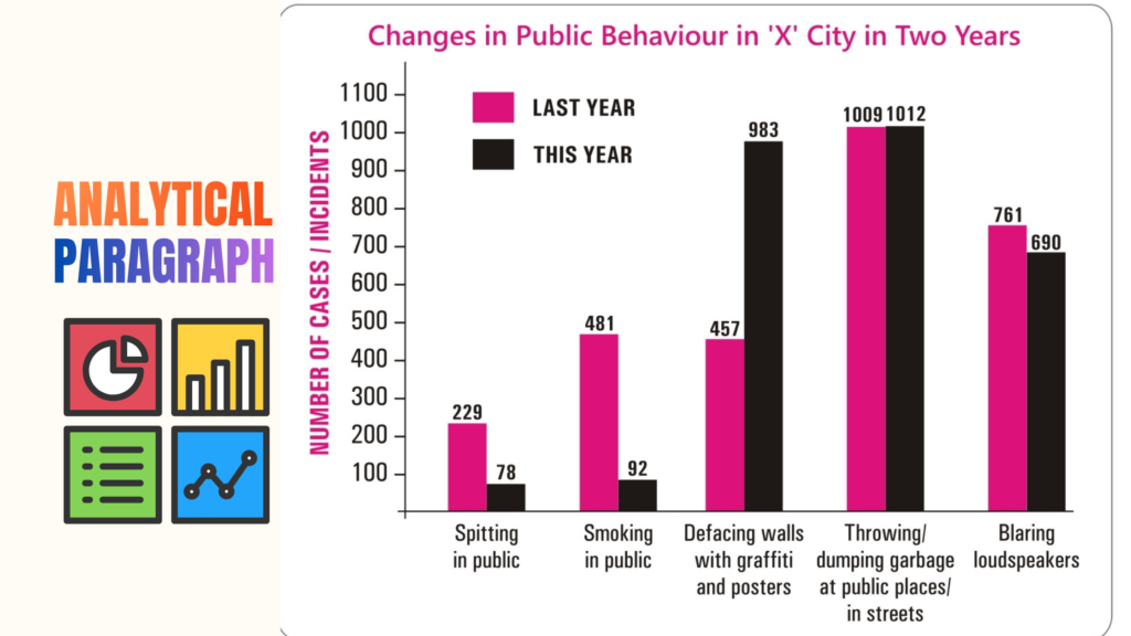
Sample Answer
The bar graph presents/illustrates /represents data on changes in public behaviour in ‘X’ city in the current year compared to the previous year across five categories: spitting in public, smoking in public, defacing walls with graffiti and posters, throwing litter in public places and streets, and noise from loudspeakers.
There are a few encouraging trends. The number of spitting incidents decreased by nearly 66%, falling from 229 cases last year to only 78 cases this year. Similarly, smoking in public witnessed a dramatic decline from 481 reported cases to just 92 cases, representing a reduction of over 80%.
However, the problem of defacing walls with graffiti and posters worsened significantly. The number of such incidents more than doubled, increasing from approximately 457 cases to 983 cases during the current year.
The use of loudspeakers showed a slight improvement, declining from 761 cases last year to 690 cases this year. On the other hand, there was little change in the habit of dumping garbage in public places and streets.
Overall, public behaviour in ‘X’ city has improved in certain aspects, particularly regarding spitting and smoking. Nevertheless, greater efforts are required to control wall defacement, littering, and excessive use of loudspeakers.

Founder of Englishfry.com, a captivating and knowledge-driven blog & Founder of Android app/website Studyfunnel.com, an online Mock Test Series Portal. With a wealth of experience spanning over 20+ years, he has excelled as an Ex-Asst.Professor, Teacher, Amazon published author, Website Developer, Graphic Designer,Blogger,Poet, and Creative academic content writer publisher of 4 academic books available Online on Amazon & Flipkart.Internationally Certified as the World’s Top 100 admired Educator 2021 by theexcelligent.com,National Award recipient-Golden Quill award for Best English educator 2024,Receipent of Indian Literature Award 2026.His tryst in Literature helped him realize his love for writing and telling stories. A tech-savvy language nerd by day and, a passionate writer by night, he now translates his experiences into tales of wisdom served with a side of humor.His widely recognized profound insights ,captivating writing style of weaving words make him contribute to prestigious publications and a sought-after authority in the field that transport readers to extraordinary worlds.